Posted in Featured, Pens, Product Reviews, Writing

Visconti Mirage

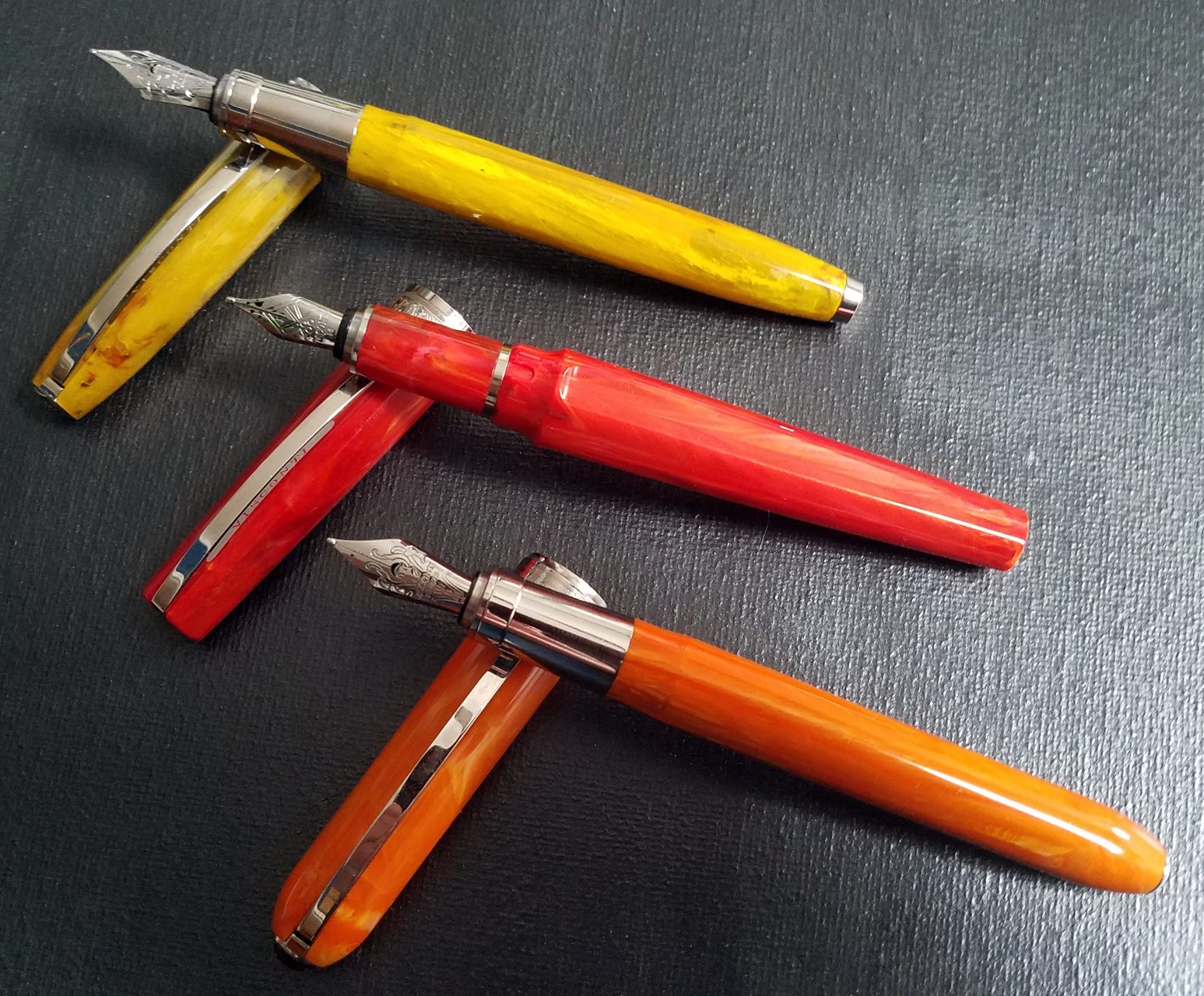
Visconti Mirage, Coral Red, B Nib – Overall: 7.4/10

I’m not sure I qualify as a Visconti junkie, but I’m not far off.  I don’t make a point to buy every Visconti I can, but over the years I’ve collected many of the popular models–and a couple of the very limited pens are the highlights of my collection. This wasn’t a conscious decision–I guess the designers at Visconti speak to my definition of beauty.  So when I saw there were some new pens coming out in 2018-19 I was certainly keeping an eye out.  The Mirage is the first of these new pens, and over the holidays, I kept my eyes open for good deals, and I was able to pick up the Visconti Mirage for just under $100US. It is my 16th Visconti.

This is a review of the Mirage–not a comparison–but since this pen is so new, I’ve included some comparisons to two popular Visconti Pens–the Rembrandt, and the Van Gogh (modern).  I’ve chosen these because, taken as a group, the Mirage, Rembrandt and Van Gogh represent the lowest cost pens from Visconti’s lineup, and they all come with steel nibs.

miragetable

From that chart you can see that the three pens are roughly the same size and weight.  There’s nothing surprising about this, and most pens that aren’t described as pocket pens or oversized pens are probably roughly in this range, but as this is a new design and a new material–this specific acrylic–it’s worth noting how it sizes up to similar pens.

Since I received the pen a couple of months ago, I’ve had it inked up–more or less continuously–with 4 different inks, each from a different ink manufacturer.  So it’s safe to say I gave the pen a thorough test.  I did have two problems with the pen–one was cosmetic and one dealt with flow–which are detailed below, in the appropriate sections.  Both were fixed quickly, and for free, though they did affect the score.

Appearance: 8/10

The beauty of the Visconti pens was one of the things that drew me to them years ago.  The Homo Sapiens is one of the few basic black pens that I’ve ever found beautiful, and the acrylics of the Van Gogh pens are just gorgeous.  The acrylic of the Visconti Mirage, while not as gorgeous as it’s pricier cousins, is still quite nice, with a depth that is usually reserved for pens that are more expensive.

It seems they’re also trying out some different pen shapes this year.  The body is slightly faceted–three facets, alternating between three non-facets. When closed the Mirage has a slight bulge at the middle that looks quite nice.  And when open there is a large step from the barrel width down to the section, but they’ve smartly moved this narrowing back so no matter where on the section you hold the pen, the step shouldn’t be a problem.  However, when the pen is posted I think the bulge makes the overall profile look a bit strange–something I’ve noticed with all of Visconti’s newly announced pens.  Since I don’t post my pens, it doesn’t really matter to me, but it might to you.

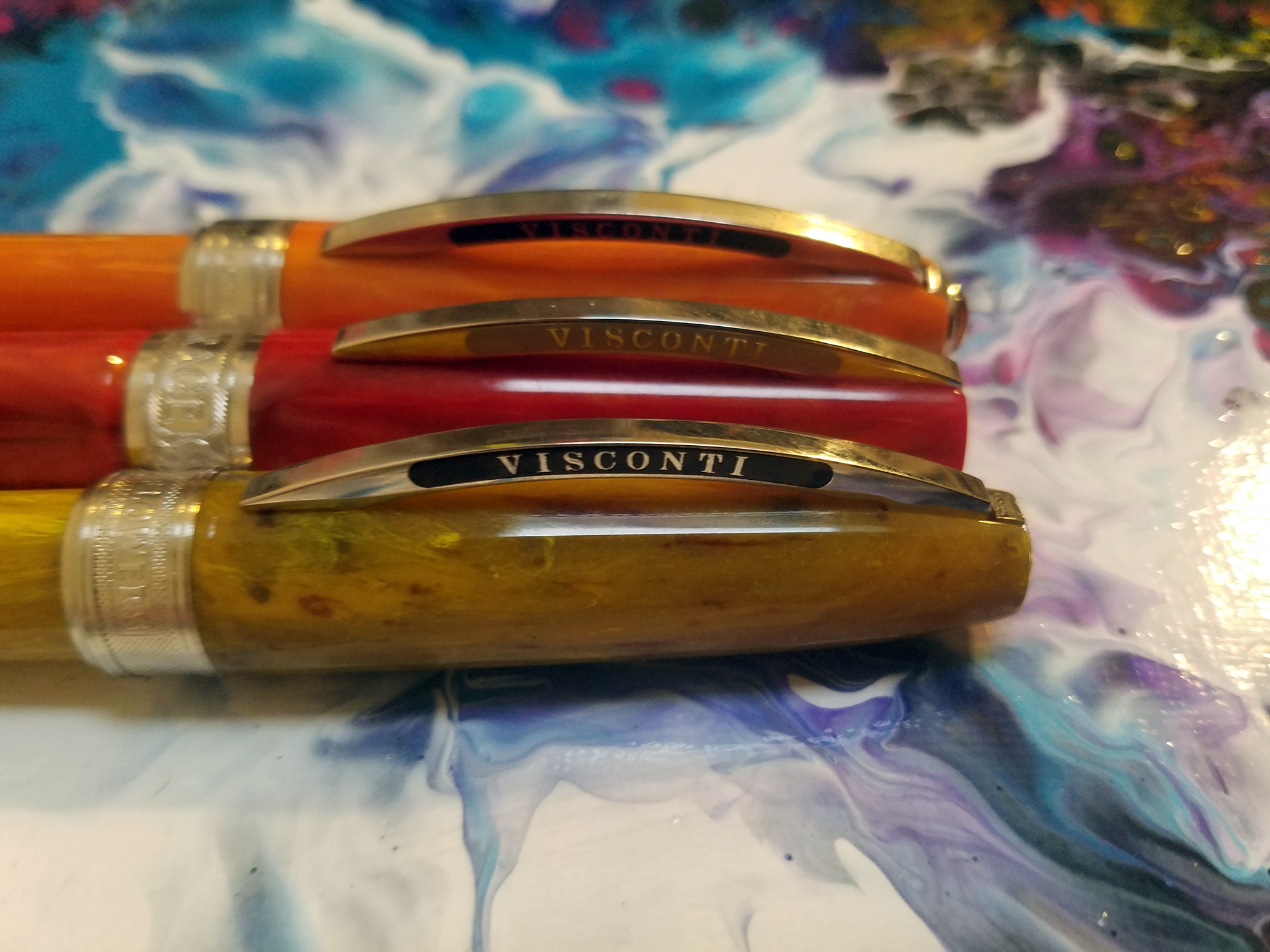
Two significant changes–compared to the older Viscontis–are the clip and the MyPen finial

20181228_16182920181228_161846

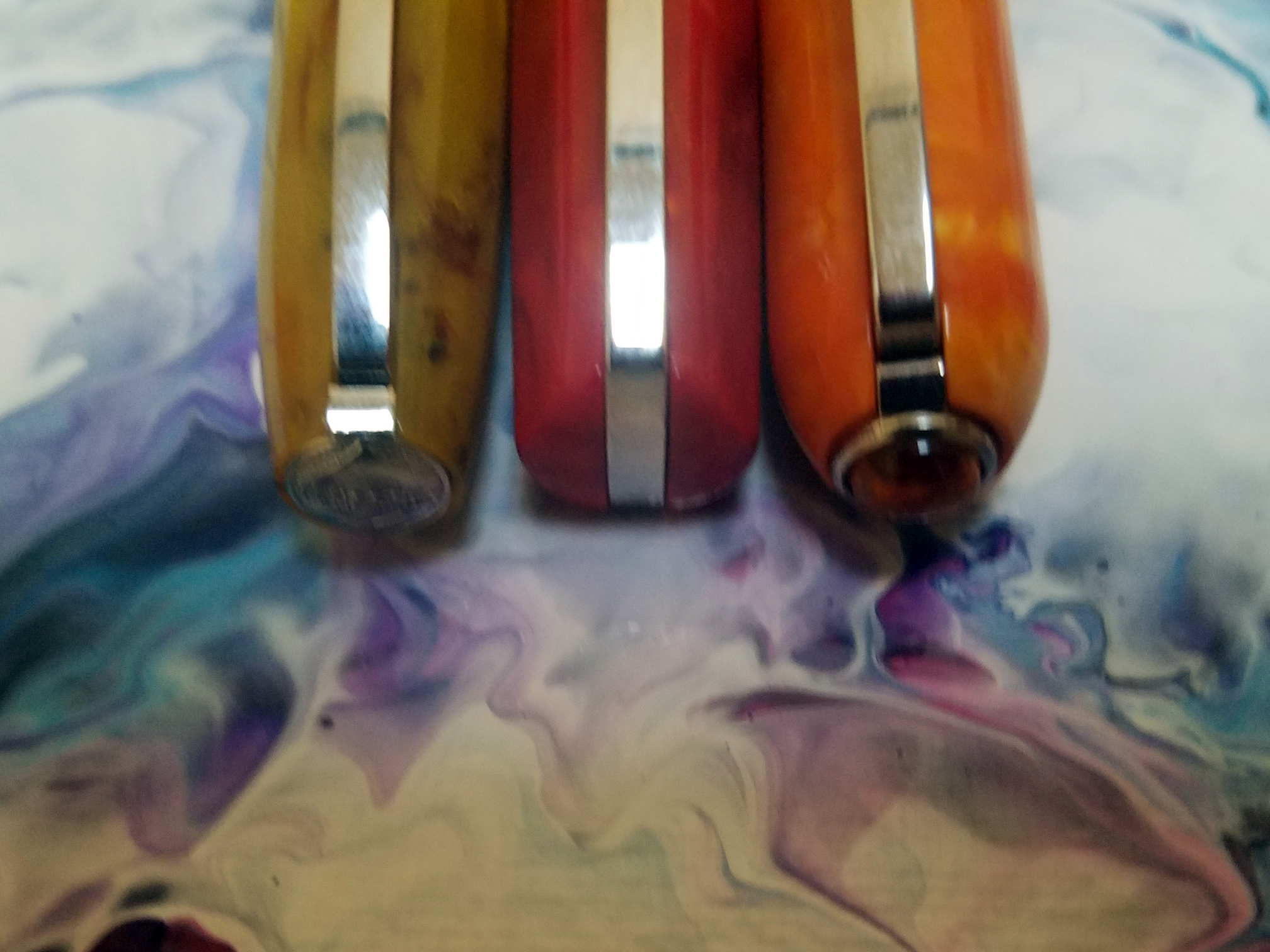
I’ve heard so many complaints about the Visconti Bridge Clip that it’s become white noise.  Mention Visconti and someone will complain about the clip.  I’ve never had a problem with it.  But with the Mirage, Visconti has redesigned it.  As you can see the clip now extends up and over the cap of the pen (actually it did in the older pens, too, but that was covered up by the finial).  There are some other changes to the clip that I’m not completely up on, but I’ve heard that some people think there’s an improvement and some don’t.  I didn’t have a problem with the old one, nor do I have a problem with this one.

They’ve also moved the MyPen finial from the top of the cap, to the end of the barrel.  I have mixed feelings about this move.  One one hand, now when I write–unposted–I get to see the finial.  So that’s great.  However, when it’s in my display case, in my carry case, I don’t see it at all.

The acrylic feels great, and I like that the metal sections of the Rembrandt and Van Gogh have been replaced with the acrylic section.  The magnetic cap now has three channels that keep the cap from spinning when the pen is closed, and these grooves are placed so they don’t interfere with the writing.

It’s a pretty pen–if not as beautiful of some of the more expensive pens are, and as far as looks go, I’m happy.

Construction: 9/10

20181228_161856

The pen looks and feels well-made.  The magnetic cap closes firmly and there very little wiggle–and when it’s closed the facets on the body line up with the facets on the cap.  The clip, and various rings are secure and look nice.  The acrylic is well machined, with no flaws.  And everything joins together without risk of cross-treading.  Especially at this price point, there are few pens this well-made.

I did, however, have one problem–which is why I scored this a 9 and not a 10.  The first pen I got had a chip in the little raised lip around the MyPen finial.  I noticed it when I was taking pictures for the first draft of this review.  When I contacted Coles of London, this was fixed quickly, and free of charge (shipping, too).  Even top-line products occasionally arrive broken, or cracked or chipped, and since it was fixed, and since I have not heard of other Mirages that arrived with imperfections, I don’t want to give this one defect too much weight, however the type and placement of the damage makes me think that the chip came from being dropped during production or packaging, and simply wasn’t caught, and it worries me that this material may chip easily. Past models in this range have usually has metal ends–I’m sure partly for aesthetics–but it’s also helped protect an at-risk part of the pen…and the Mirage doesn’t have that metal end.

Filling: 6/10

20190105_2129038 is my default score for a Cartridge/Converter system, where the end of the section is smooth, making it easy to wipe off after filling.  The Mirage meets this criteria.  So why is it a 6?  The pen shipped with the wrong converter.  It should ship with a threaded converter but it shipped with a non-threaded.  The problem is, the threads are inside a little metal collar so I didn’t know I had the wrong converter.  When I tried to fill it I got a lot of bubbles, and when giving the pen a test drive it ran dry after about 3/4 page of text.  After some looking I thought maybe I had a bad converter and I contacted Coles of London.  They told me the wrong converter has been included and sent a replacement for free.  Since then I’ve filled the pen 3 times and wrote the converter empty with no problems.  So once you have the right converter it’s fine, but I’ve read comments from other people who also got the wrong converter, so this is, to some degree, a repeated issue.  My guess is this is a new-product-glitch and will work itself out quickly, but it’s an issue you need to watch out for.

Nib: 6/10
20181228_161712The nib is first–and only real problem with the Mirage. This nib represents a new nib for the Visconti line.  Frankly I loved the old #5 Visconti nibs.  For me, they were the benchmark for #5 steel nibs.  I even got my hands on two of the #6 steel and fitted them into other-branded pens, with fantastic results.

This nib is–I’m guessing–a #4, because it’s a little smaller than the #5.  It’s also plainer.  The engraving leans away from Florentine and toward Art Deco (I’m aware that I’m taking wild guesses at the correct names for artistic styles.). There’s also an odd coding system–above the word Visconti there is one circle for a F, two for a M, and three for a B–which is redundant because F, M or B is engraved under the word Visconti.

So far this is superficial stuff.  However, because the nib is smaller, it’s less flexible.  It never was a flex nib by any stretch, but there was some flexibility to the longer tines.  It’s what I loved about the Visconti steel nibs.  They were always Bock nibs, but they were manufactured to specs that differentiated them from other Bock nibs.  These?  Meh.  They’re certainly not bad, and I have plenty of steel nibs that don’t measure up to these.  But they’re nothing special.  And why?  The existing #5 nibs were awesome.  And because this is a different size nib, I won’t be able to switch out my own #5 steel nib.

Test Drive: 8/10

Because of the problems I had with the pen at the beginning, I gave it a much more thorough test drive than I normally do for a review. If I’m being honest, I was trying to make it fail, because if it was going to have another problem I wanted to know about it now, rather than later.  After 3 complete converters, writing normal speed and as fast as I could (just making squiggles) the pen performed wonderfully.  No skipping, the feed kept up with whatever speed I threw at it, and the B nib was wet without gushing or clumping.  Every time the pen ran dry I opened it up knowing I was going to find a full converter….but, nope….empty converter…everything’s good.

The weight and size of the pen is good for extended sessions.  I might have scored it a 9 (or even higher) if it had that good ol’ #5 Visconti steel nib.

Overall: 7.4/10

So what do you expect for $127US.  I expect decent materials, but good usability–because for that price, I’m hoping for a solid EDC.  The Visconti fits that bill, and also manages to be prettier that many of not most of the pens in this range.  It’s an easy pen to use, so it would be fine as an entry-level pen, or someone’s first foray into the World of Visconti, then it’s probably not a pen that’s meant to fall in love with.  I like the Rembrandt better–mostly because of the nib–but the Mirage is less expensive.

For $127 I expect a good pen, but not a great pen.  And that what the Visconti Mirage is.

Posted in Featured, Pens, Product Reviews

My Review of a Minty Edison Collier

edison_stand

I’ve wanted an Edison Pen for quite some time. Not only does Brian Grey have a reputation as an excellent craftsman, but to my eyes his designs are quite beautiful. But I had a good bit of trouble finding the Edison pen that was for me. A couple of years ago I got one of the first seasonal editions of the Nouveau Premiere; and while I liked the pen quite a lot, it smelt of burnt plastic and it never seemed to dissipate (I still don’t know if the smell was specific to that one pen or to that particular material). I was able to recoup almost all of what I paid for it, but I was still left without an Edison.

I used the money from the sale of that pen to commission a custom Extended Mina, but during the long wait I read some online reviews and found a small aspect of the pen that soured it for me (most people don’t seem to care much about the feature, but the pen world is full of people who are OCD about their pens, and I’m no exception) so I converted my custom order into an outright purchase–an Edison Menlo.

I reeeeeeeeeally wanted to like the Menlo, but that one just wasn’t the pen for me.  I’m not sure if the pen was defective or if my warm hands just aren’t compatible with eye-dropper or large capacity fill systems.  But Brian let me return the pen for a refund/credit, and I was back to trying to find the right pen for me.  Ultimately I decided on the Collier, in part because of it’s large size, but also because I liked the shape.  After picking my material Brian graciously put me at the front of the design queue, so it wasn’t too long until I had the pen in my hands.

Here are my thoughts on the Edison Collier in Translucent Mint Swirl with a steel 1.1mm stub nib.

spoilerI may not get to keep this one either. My wife, who is generally partial to very thin, very light pens has already hinted that, while this pen is huge, I shouldn’t panic if I notice it missing.

edison_sample

Note: for the first 2 sections, which concern the Edison Pen Company and not the pen, I will provide comment but not a score, as only the pen categories are scored.

Design/Ordering Process: Not scored
The website is good, not great.  It’s a clunkier experience than most pen sites you’re used to.  If you’re ordering a custom pen, that’s fine, because you probably don’t want to build your pen through a series of dropdowns–you want to talk to the guy who’s going to put it on the lathe.  But for the person who sees what he wants while scrolling through the inventory, they’d probably want to just drop that in their cart and checkout.

Also, the site is divided up onto different domains, which ads to the clunky feel.  It’s definitely nice to able to scroll through all those pictures of current pens, past pens, pen materials, etc, but if you’re deciding what you want that can mean a lot of jumping back and forth between the main site and the picture album site.

However, it’s a huge plus to be able to see all those pen pictures.  Without them I never would have landed on this model or this material.  None of this was enough of a bother to stop me from ordering a pen, and truthfully I think we’d all rather Brian spend his time making pens instead of working on his website, but if he’s got someone to do his website for him, it could use some updating.

Customer Service: Not scored
If you read the intro above, you’ll know that I had a lot of communication with Brian during the months that I was in the queue for a custom pen, then waiting for my Menlo, then waiting for a repair, then back in the queue.  During this time, Brian was always ready to assure me that he wouldn’t be happy until I was happy.  And based on the time he spent on my problems, I believe him.

If I had one knock in this area it’s that communication can sometimes take a while.  Edison Pens isn’t a one man operation, but it all revolves around Brian making a custom item in a niche market.  So when he goes on vacation, production basically stops.  When he’s out email doesn’t necessarily stop, but you’re likely to get a personal response that tells you Brian’s on vacation, and you’ll get an answer when he’s back.  Likewise, if he’s headed to a pen show you may have to wait a few days as well.  I don’t begrudge Brian these breaks, but if you’re going to order from him you’ll need to understand that when you want something from a craftsman you can’t expect factory-like production times.

edison_axisAppearance: 10/10
This is a seriously sexy pen.  Part of that stems from the material I picked, and I’ll get to that, but it’s the shape of the pen I like best.  This is not a small pen, and many of the oversize pens I’ve used either make the barrel straight, or go a little overboard with giving it some curves.  I like the gentle lines of this giant.  And yes, the material is awesome.  It’s a little frustrating to look at the pictures because I just don’t have the photography skills to show off this material; but my wife hit the nail on the head when she said it looks like the glassy-swirl marbles so many of us has when we were kids.  It looks so nice my other pens are getting jealous–I haven’t touched another pen since I first inked this one.

Construction: 10!/10
There is part of me that wants to score this an 11, but I respect math too much to do that.  Instead I’ll give it a 10 with a bang (that’s an exclamation point for you non-programmer/not grammar nerds).  There are essentially two aspects to the construction score–there’s the design and then the execution of the design.

With the Collier, as good the execution of the design is, it’s the design itself that makes this pen so special.  The seam at the clip, where the cap meets the finial, is so smooth I can only detect it with my fingernail when carefully looking for it.  The finished surfaces are smooth, inside and out, I can see through the pen with no distortion.

But as I said, the design is what makes this pen special.  It’s a pretty big pen–bordering on huge.  It’s longer than my Homo Sapiens, Cosmos, Al-Star, Van Gogh Maxi, Franklin-Christoph 02, and even my Newton Gibby; and as thick or thicker than all of them.  But even with all that size, it has a relatively normal-sized grip, and it’s fairly light (30g overall, 20g without the cap).  The curves help give the pen a great balance–a tiny bit front heavy.

One note about the design:  The pen does not post.  At all.  Once upon a time this would have been a deal-breaker for me, but in the last couple of years I’ve completely stopped posting my pens.

Filling: 8/10
8 is my default score for a Cartridge/Converter system, where the end of the section is smooth, making it easy to wipe off after filling.  The converter is the default system for this design.  You can pay extra to switch to a bulb filler, or pump system, but I stuck with the converter–I might have paid extra for a piston fill, but that wasn’t offered.

edison_nibNib: 7/10
I went with the steel 1.1mm stub.  I like this nib, I don’t love it.  It’s a little too rounded for my taste–generally I lean toward a slightly rounder stub, rather than crisp, but even for me this one is too rounded. I’m not sure how much control Brian has over that, as he gets his nibs from JoWo.  Brian does tune the nibs he sells, and this nib is certainly smooth and wet enough for my taste.

As nice as it is, it’s nothing special, and I’ll be looking to upgrade this nib soon.  I might send this one off to a nibmeister for some shaping and a little added flex, or I might try to source a higher quality #6 nib to replace this one.  I wonder if Visconti makes any steel #6 nibs.

Gold nibs are available from Edison, but I’m less enamored of gold nibs than the fountain pen population at large.

Test Drive: 9/10
The whole point of a pen is how it writes. Everything else is prologue. Can I write with the damned thing? Can I write for hours? When I clean out my pens and decide to ink up 3 of them, will my heart reach for the Edison Collier?

This pen has been constantly inked since it came in the mail.  I’ve filled it will Pilot Iroshizuku Kon-peki, and Caran d’Ache Vibrant Green, two inks I use often and am very familiar with.  I’ve burned through at least 15 full pages with each ink, and the thickness combined with the light weight results in remarkably little hand fatigue.  I enjoy writing with this pen a lot.

Overall: 8.8/10
8.8. That’s a bit lower than I expected going in.  But if I’m able to source a high-quality replacement nib, or get my nib-guy to work his magic, the score could come all the way up to 9.6.

I have a feeling the Edison Collier will get a lot of use.

Posted in Family, Featured, Writing

A Common Enemy

writers_block_binder-p127099439763846099ffe6m_400Writer’s Block is a pain in the ass.

If you follow me on this blog, or on the other blog I contribute to–Today’s Author–you’ve doubtless noticed that I’ve been quiet lately.

This is not because I have no time to write.  It’s because every time I sit down to write, I spend all my time trying to wring even the smallest bit of creative thought from my atrophied pool of creative energy.

For the last couple of months I’ve been free writing by hand each morning, in an attempt to get the gears grinding.  But as often as not, I have resort to finding a writing prompt just to give me direction.  And it feel like busy work.  Sure I’m filling the pages, but it’s workaday drivel, and isn’t furthering any writing goal.

In my house I’m not the only writer.  My new wife enjoys writing, too, and last year she self-published her first YA Novel.  Lately, she’s stuck, too–not quite as stuck-neck-deep-in-the-mud as I’ve been, but she spends plenty of time spinning her wheels.

Last night she and I decided to try something new.  We’ve challenged each other to publish something new to our own blogs at least once each week.  It can be a thought, a rant, a product review, a book review, or–fingers crossed–something truly creative.

Why on our blogs, and not in our own notebooks?  We’re trying to keep it public so we can nag encourage each other when the other one is falling a little short.

So, here is the first of what I hope to be a renewed creative presence on the Interwebs.the-interwebs-20100930-084712

Posted in Featured, Lessons, Site News, Writing

Consequences

I ushered in 2014 by making myself a promise. I wanted to write. As part of that I wanted to revitalize my blog. My reasoning was—and still is—that if I’m working to update my blog on a regular basis, I’ll be writing more often, and this should bleed into other areas of writing. It’s the same idea that journaling everyday will help us write more.

To give myself a real consequence I said that if I didn’t make significant contributions to my blog, that I would delete it.

Well, it’s late March, and I haven’t changed my habits much. So I converted my self-hosted blog, to a free WordPress blog. I cancelled my webhosting, although I did keep my domain registration—and forwarded it to my free blog.

Hopefully, this will stop me from frittering away writing time, by maintaining, updating and tweaking the design of my blog. I’ll still spend a little time choosing the right template, and customizing the header….but after that, there’s not much else to tinker with unless I want to spend more money.

Hopefully this move, will convince me that I’m serious about my writing—and when I threaten myself with a consequence, I’ll follow through.

Posted in Featured, Uncategorized, Writing

My Focus for 2014

My creative writing goal for last year was to review and regroup. I spent the year going through old notes, unfinished stories, snipets, ideas, and a lot of junk. The idea was to judge what was worth keeping and what could be permanently forgotten. Then I took all that and organized it so that I can get to it again.

And I did a pretty good job. I’m left with one story that is unfinished that I still feel is worth finishing, and a good-sized database full of characters, scenes, dialogue, and thoughts that I can both find and use, when I need them.

But all that was prelude to a different goal. Now that all that is out of the way, this year I’m going to focus on redeveloping the habit of writing. Being creative is hard. Especially if you don’t use it everyday. And I’ve gotten out of the habit of writing.

There are many excuses I could give for this, and some legitimate reasons, too. But there’s no point in spelling them out, because even if you have real reasons you’re not writing, if you have the time and energy to list them, they’ve become excuses.

So what are my goals?

  1. I will write everyday. It might be a blog post, or a journal entry. Maybe personal correspondence. And just maybe a little bit on a story.
  2. I won’t schedule any exceptions to #1, but I will allow myself 1 failure/week without guilt.
  3. Since I’m rebuilding a habit, I’m going to start small. January 1-January 15, 5 minutes/day minimum…January 16-January 31, 10 minutes/day minimum…and so on. So by the Ides of March my minimum will be 30 minutes per day.
  4. I will learn not to stop when I’m on a roll.

And to give myself the threat of consequence…if I don’t contribute, SIGNIFICANTLY, to this blog in 2014, I’m deleting it.

You may notice that these goals do not include writing X stories, or anything to that effect. In fact I do have a project, that I’ll be working on this year–Rob Diaz and I, will be compiling and editing a collection of short stories. But right now we’re in the early stages and haven’t developed a deadline. Keep an eye out for news.

Posted in Anti-Resolutions, Featured, General Silliness, Writing

My 2014 Anti-Resolutions

2014Written based on the Today’s Author Write Now! prompt on December 31, 2013, in which we are asked to creatively list ten things we will not do in the coming year.

Today’s Author is a blog designed to help get you off the couch and back to writing.

The rules are simple:

  • List ten things you resolve NOT to do in the upcoming year.
  • Be as creative as possible.

To get this thing rolling, here are…

My 2014 New Year’s Anti-Resolutions

  1. I will NOT leave scores of opened cans of tuna around my apartment building hoping to attract feral cats to serve as my army of evil minions.
  2. I will NOT try to convince my kids that the manna referred to in the bible is actually cranberry sauce.
  3. I will NOT refer to my collection of fountain pens as my preciouses when we have people over.
  4. I will NOT attempt to experiment on the scientifically illiterate by professing the theory that the sense of smell is an illusion and the invention of the government.
  5. I will NOT amuse myself at cocktail parties by asking the males whether they have six fingers on their right hand.
  6. I will NOT try to advance my career by getting co-workers to refer to me as Red Five.
  7. I will NOT stop in my quest to change grammatical standards to mandate that punctuation go after the closing quotation ONLY when it makes mathematical sense.
  8. I will NOT, on the occasion of my 42nd Birthday, celebrate by walking around in a bathrobe and claiming to be the second coming of Arthur Dent.
  9. I will NOT do what the cans of Red Bull tell me to.
  10. I will NOT attempt to thwart the NSA by resurrecting my disastrous plans for the Analog Cell Phone.
Posted in Featured, My Books, Writing

Deck the Halls: Festive Tales of Fear and Cheer

thumb_dth

Deck the Halls traverses the joy and jeopardy of the festive season, from Yule to Mōdraniht, Summer Solstice to Years’ End. The stories journey through consternations and celebrations, past, present and future, which might be or never were.

Along the way you’ll meet troll hunters, consumer dissidents, corset-bound adventurers, a joint-toking spirit, big-hearted gangbangers, an outcast hybrid spaceship, petrol-toting politicians, mythical swingers and a boy who unwittingly controls the weather.

Heart-warming and horrifying, the collection is a merry measure of cross-genre, short fiction subverting traditional notions of the holiday season.

My own story, “title,” was inspired by the lyric “see the blazing yule before us.” And I used that inspiration for a mild send-up of Dickens.

[button link=”http://emergent-publishing.com/bookstore/deck-the-halls-festive-tales-of-fear-and-cheer/” type=”icon” icon=”notice” newwindow=”yes”] Buy the Book[/button]

Posted in Featured, My Books, Writing

Eighty-Nine

“Eighty-Nine” is the third offering from Literary Mix Tapes (a quarterly crowd-sourced short fiction anthology inspired by music), and the second one I’m a part of.

Twenty-Six original stories inspired by Twenty-Six different songs, all released in 1989. It was the year the Berlin Wall came down and Voyager went up. In San Francisco and Newcastle the ground shook, in Chernobyl it melted. Tiananmen Square rocked the world and Tank Man imprinted on the international consciousness. These Twenty-Six stories reinvent what it was like to live in a world moving from one decade to the next.

My own story, “Shrödinger’s Cat,” was inspired by the Eurythmics “Don’t Ask Me Why.” 1989 gave us the scientific hoax of Cold Fusion, as well as the beginning of the computer virus era, and these form the backdrop for what my editor described as a cyberpunk-noir must read. And that girl on the front cover…that’s Amiga…one of my main characters.

[button link=”http://emergent-publishing.com/bookstore/eighty-nine/” type=”icon” icon=”notice” newwindow=”yes”] Buy the Book[/button]

Posted in Featured, My Books, Writing

If I Had It To Do Over Again

The Setup

Jodi Cleghorn, my pesky beloved editor, on her own blog, posed a question for me to answer.

Two years ago, she and Paul Anderson, two fellow bloggers at Write Anything, asked me if I’d like to write a story for an anthology they’d dreamed up. “It’s called Chinese Whisperings. Did you ever play that game when you were a kid? In America, I think it’s called telephone. (OK, I’ll admit that’s probably not a direct quote. I probably still have the email but I didn’t want to spend the time looking for it.) Two years later that, story has been done, plus another in the series, the eBook has been out for over a year, I’ve published another story through working friendship collaboration (with two more on the way), and Chinese Whispering is about to publish it’s first two volumes in paperback.

In case you decided to skip that paragraph…it’s been a busy two years.

The First Chinese Whisperings books was written a little bit like a camp-song sung in the round. Each author had to take their main character from the cast of secondary characters in the prior story. And now that Chinese Whisperings: The Red Book is about to come out in paperback (Oct 11, 2011, in case you were wondering), my frenetic energetic friend from across the world has put this question to me: What would I do if I had a second chance at my story? Is there another character that I whose story I would have chosen to tell?

The Response

Short Answer

No. (I could make it shorter, but I liked including the period.)

Long Answer

As I was waiting my turn to write my story (sixth out of ten) I was able to read the stories before mine as they were turned in. I remember while reading Jason Coggins’ Something Mean in the Dream Scene, wanting very badly to be the next author in line, because a story came to me almost fully formed about one of the characters. But having just reread that story I can’t for the life of remember who that character was…or what the story was.

Then when I read Tina Hunter’s Innocence I drew a blank. I didn’t want to write the story of any of those characters. But Jodi reminded me that I’m always like that at the beginning of a project. And she was right. After about ten rereads the the secondary characters of that story were all already too involved in the events of the book. I needed to look at the background characters. When I finally did choose the story it came out quickly, if erratically.

But looking back at the book as a whole, I can’t think of a character I would have rather picked up on than Simon.

Although I have to admit I was a little bummed that Jasmine Gallant didn’t tell Verity’s story. But it’s hard to hold a grudge when she did such a great job with Dash.

This will all make so much more sense to you if you’ve read the book. Don’t have a copy? Never fear. It’ll be out in paperback in less than a month.

I’d originally tagged Annie Evett as the next to answer the question, but it seems she, as well as most of the other female writers are busy. So to keep things going I’ll tag Rob Diaz.

Posted in Featured, My Books, Writing

Nothing But Flowers

“Nothing But Flowers: tales of post apocalyptic love” is the second offering from Literary Mix Tapes (a quarterly crowd-sourced short fiction anthology inspired by music)…. and I am fortunate enough to have a story included.

Inspired by the Talking Heads song of the same name, Nothing But Flowers explores the complexities and challenges of love in a post apocalyptic landscape. From plague to fundamentalist governments, comets and war, from terra firma to outer space the people on these pages face up to what it means to love and be loved when you’ve lost everything.

My own story, “There But for Fortune” is included in the anthology.

[button link=”http://emergent-publishing.com/bookstore/nothing-but-flowers/” type=”icon” icon=”notice” newwindow=”yes”] Buy the Book[/button]