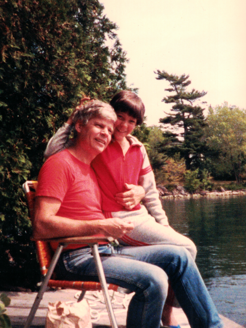
I don’t eat apple pie. I like it…at least I remember liking it. But I haven’t eaten it for 32 years. Apple pie conjures up bad memories. Memories of a specific moment that is a scar across my heart that has never healed. Memories of sickness and death.
1986, Virginia Gardens, Florida. It was Sunday evening. I’d spent the weekend with my dad, stepmother and stepbrother, and they were bringing me back home. We stopped at Denny’s for dinner. I don’t remember what we had, but I do remember that after, my dad suggested everyone get pie.
Denny’s food was never anything special, but they used to have pretty good pie. And dozens of varieties. My brother and I ordered. My dad and stepmother did not–though I didn’t catch that at the time. I got apple pie à la mode, with cinnamon ice cream.
Our pie arrived and we dug in. After two bites my dad started talking. The energy from the table drained away. This felt rehearsed. I didn’t put the fork down, but I stopped eating.
He talked about his back surgery two years before. He talked about complications and blood transfusions. I avoided eye contact, and watched my ice cream melt. He talked about blood supplies, and contamination, and infection. I watched the pie in front of me get soggy. He talked about experimental drugs, and being hopeful and worst case scenarios.
And I watched my plate of apple pie, because I was 14 years old, and knew if I looked him in the eyes I’d crumble to pieces. And at 14, I wasn’t strong enough to know that was ok.
I’ve been back to that Denny’s dozens of times. It was a popular hangout with the nerd-clique in high school. I always avoided that table, but even going into the building was enough to get me to sink into moodiness. My closer friends noticed, and asked me about it. I didn’t trust them enough to tell them why.
He died in ‘89, but it wasn’t for a couple more years that I made the connection with apple pie. I didn’t order it often, but when I did, the gloom returned. ‘92 was the last time I ate apple pie.
Years ago I had a friend who was very proud of her apple pie. She brought it to every work potluck, and every party. She got lots of compliments on it. We were close, and she asked me many times to try it. I know all she wanted was simple validation from a friend. But I just couldn’t bring myself to eat it. After the tenth time she got mad, so I pulled her aside and explained why. She was still mad and told me after 10 years I needed to get over it.
I said that I didn’t want to get over it. She said I was sad because I wanted to be sad, and we didn’t speak much after that.
I know I could get over this association. It’s been 32 years, and I know I could break it. But…
The memory of that pie, that whole scene, is in vivid, full color. I don’t know if everyone’s memories work the same way but not all my memories are like that. Many of my memories are like faded photographs. And my memories of my dad are old. Most of them faded, still images. I can no longer remember how he moved, at least not without a cane. I can barely remember his voice. And even in my older early childhood memories, he’s been replaced by a wilted, white-haired man.
But that day, in that chair, at that table, with soggy, wasted pie on a plate with a chipped edge that I turned to face away from me, is a memory in full color. I can smell the pie. I can smell the cigarette smoke from three tables over. I remember my dad wearing his Levi’s jean jacket–it wasn’t cold but he was already sick. I remember my feet hurt because I needed new shoes.
It’s a terrible memory, but it’s probably the most vivid, untouched memory I have of him. And I’m afraid if I let it go I’ll be letting more of him go.
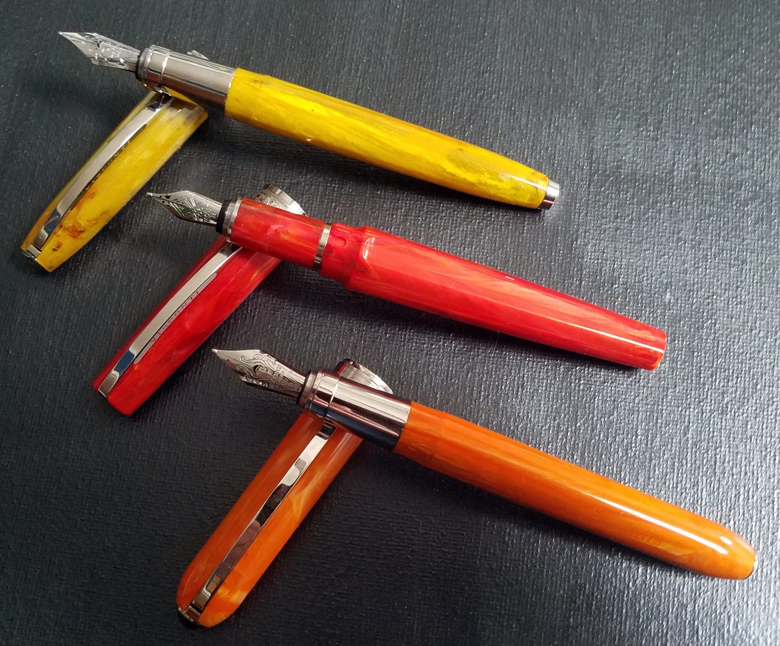
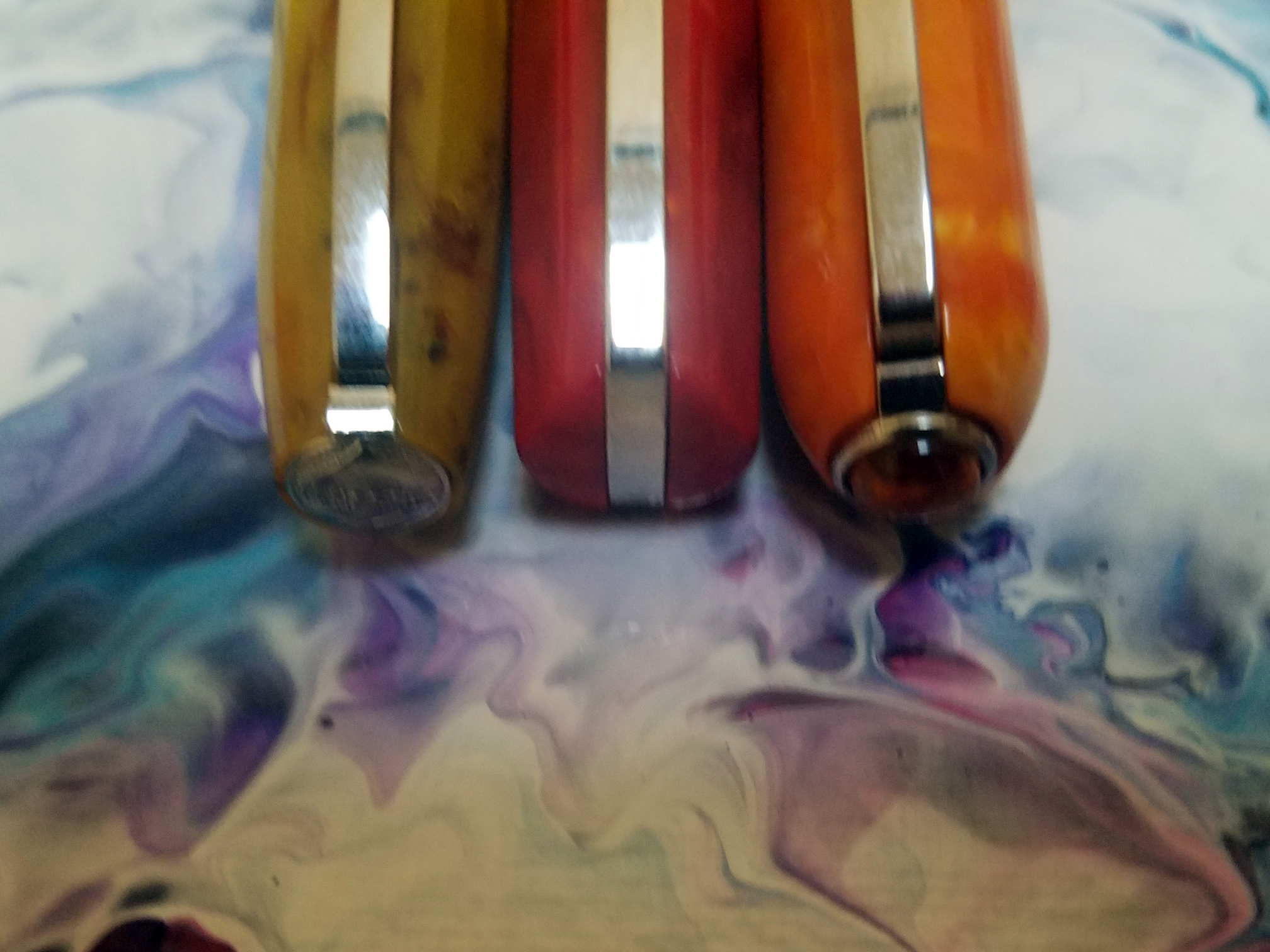
Visconti Mirage, Coral Red, B Nib – Overall: 7.4/10
I’m not sure I qualify as a Visconti junkie, but I’m not far off. I don’t make a point to buy every Visconti I can, but over the years I’ve collected many of the popular models–and a couple of the very limited pens are the highlights of my collection. This wasn’t a conscious decision–I guess the designers at Visconti speak to my definition of beauty. So when I saw there were some new pens coming out in 2018-19 I was certainly keeping an eye out. The Mirage is the first of these new pens, and over the holidays, I kept my eyes open for good deals, and I was able to pick up the Visconti Mirage for just under $100US. It is my 16th Visconti.
This is a review of the Mirage–not a comparison–but since this pen is so new, I’ve included some comparisons to two popular Visconti Pens–the Rembrandt, and the Van Gogh (modern). I’ve chosen these because, taken as a group, the Mirage, Rembrandt and Van Gogh represent the lowest cost pens from Visconti’s lineup, and they all come with steel nibs.
From that chart you can see that the three pens are roughly the same size and weight. There’s nothing surprising about this, and most pens that aren’t described as pocket pens or oversized pens are probably roughly in this range, but as this is a new design and a new material–this specific acrylic–it’s worth noting how it sizes up to similar pens.
Since I received the pen a couple of months ago, I’ve had it inked up–more or less continuously–with 4 different inks, each from a different ink manufacturer. So it’s safe to say I gave the pen a thorough test. I did have two problems with the pen–one was cosmetic and one dealt with flow–which are detailed below, in the appropriate sections. Both were fixed quickly, and for free, though they did affect the score.
Appearance: 8/10
The beauty of the Visconti pens was one of the things that drew me to them years ago. The Homo Sapiens is one of the few basic black pens that I’ve ever found beautiful, and the acrylics of the Van Gogh pens are just gorgeous. The acrylic of the Visconti Mirage, while not as gorgeous as it’s pricier cousins, is still quite nice, with a depth that is usually reserved for pens that are more expensive.
It seems they’re also trying out some different pen shapes this year. The body is slightly faceted–three facets, alternating between three non-facets. When closed the Mirage has a slight bulge at the middle that looks quite nice. And when open there is a large step from the barrel width down to the section, but they’ve smartly moved this narrowing back so no matter where on the section you hold the pen, the step shouldn’t be a problem. However, when the pen is posted I think the bulge makes the overall profile look a bit strange–something I’ve noticed with all of Visconti’s newly announced pens. Since I don’t post my pens, it doesn’t really matter to me, but it might to you.
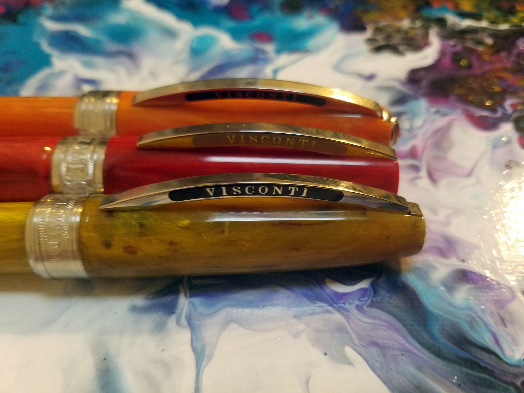
Two significant changes–compared to the older Viscontis–are the clip and the MyPen finial
I’ve heard so many complaints about the Visconti Bridge Clip that it’s become white noise. Mention Visconti and someone will complain about the clip. I’ve never had a problem with it. But with the Mirage, Visconti has redesigned it. As you can see the clip now extends up and over the cap of the pen (actually it did in the older pens, too, but that was covered up by the finial). There are some other changes to the clip that I’m not completely up on, but I’ve heard that some people think there’s an improvement and some don’t. I didn’t have a problem with the old one, nor do I have a problem with this one.
They’ve also moved the MyPen finial from the top of the cap, to the end of the barrel. I have mixed feelings about this move. One one hand, now when I write–unposted–I get to see the finial. So that’s great. However, when it’s in my display case, in my carry case, I don’t see it at all.
The acrylic feels great, and I like that the metal sections of the Rembrandt and Van Gogh have been replaced with the acrylic section. The magnetic cap now has three channels that keep the cap from spinning when the pen is closed, and these grooves are placed so they don’t interfere with the writing.
It’s a pretty pen–if not as beautiful of some of the more expensive pens are, and as far as looks go, I’m happy.
Construction: 9/10
The pen looks and feels well-made. The magnetic cap closes firmly and there very little wiggle–and when it’s closed the facets on the body line up with the facets on the cap. The clip, and various rings are secure and look nice. The acrylic is well machined, with no flaws. And everything joins together without risk of cross-treading. Especially at this price point, there are few pens this well-made.
I did, however, have one problem–which is why I scored this a 9 and not a 10. The first pen I got had a chip in the little raised lip around the MyPen finial. I noticed it when I was taking pictures for the first draft of this review. When I contacted Coles of London, this was fixed quickly, and free of charge (shipping, too). Even top-line products occasionally arrive broken, or cracked or chipped, and since it was fixed, and since I have not heard of other Mirages that arrived with imperfections, I don’t want to give this one defect too much weight, however the type and placement of the damage makes me think that the chip came from being dropped during production or packaging, and simply wasn’t caught, and it worries me that this material may chip easily. Past models in this range have usually has metal ends–I’m sure partly for aesthetics–but it’s also helped protect an at-risk part of the pen…and the Mirage doesn’t have that metal end.
Filling: 6/10
8 is my default score for a Cartridge/Converter system, where the end of the section is smooth, making it easy to wipe off after filling. The Mirage meets this criteria. So why is it a 6? The pen shipped with the wrong converter. It should ship with a threaded converter but it shipped with a non-threaded. The problem is, the threads are inside a little metal collar so I didn’t know I had the wrong converter. When I tried to fill it I got a lot of bubbles, and when giving the pen a test drive it ran dry after about 3/4 page of text. After some looking I thought maybe I had a bad converter and I contacted Coles of London. They told me the wrong converter has been included and sent a replacement for free. Since then I’ve filled the pen 3 times and wrote the converter empty with no problems. So once you have the right converter it’s fine, but I’ve read comments from other people who also got the wrong converter, so this is, to some degree, a repeated issue. My guess is this is a new-product-glitch and will work itself out quickly, but it’s an issue you need to watch out for.
Nib: 6/10 The nib is first–and only real problem with the Mirage. This nib represents a new nib for the Visconti line. Frankly I loved the old #5 Visconti nibs. For me, they were the benchmark for #5 steel nibs. I even got my hands on two of the #6 steel and fitted them into other-branded pens, with fantastic results.
This nib is–I’m guessing–a #4, because it’s a little smaller than the #5. It’s also plainer. The engraving leans away from Florentine and toward Art Deco (I’m aware that I’m taking wild guesses at the correct names for artistic styles.). There’s also an odd coding system–above the word Visconti there is one circle for a F, two for a M, and three for a B–which is redundant because F, M or B is engraved under the word Visconti.
So far this is superficial stuff. However, because the nib is smaller, it’s less flexible. It never was a flex nib by any stretch, but there was some flexibility to the longer tines. It’s what I loved about the Visconti steel nibs. They were always Bock nibs, but they were manufactured to specs that differentiated them from other Bock nibs. These? Meh. They’re certainly not bad, and I have plenty of steel nibs that don’t measure up to these. But they’re nothing special. And why? The existing #5 nibs were awesome. And because this is a different size nib, I won’t be able to switch out my own #5 steel nib.
Test Drive: 8/10
Because of the problems I had with the pen at the beginning, I gave it a much more thorough test drive than I normally do for a review. If I’m being honest, I was trying to make it fail, because if it was going to have another problem I wanted to know about it now, rather than later. After 3 complete converters, writing normal speed and as fast as I could (just making squiggles) the pen performed wonderfully. No skipping, the feed kept up with whatever speed I threw at it, and the B nib was wet without gushing or clumping. Every time the pen ran dry I opened it up knowing I was going to find a full converter….but, nope….empty converter…everything’s good.
The weight and size of the pen is good for extended sessions. I might have scored it a 9 (or even higher) if it had that good ol’ #5 Visconti steel nib.
Overall: 7.4/10
So what do you expect for $127US. I expect decent materials, but good usability–because for that price, I’m hoping for a solid EDC. The Visconti fits that bill, and also manages to be prettier that many of not most of the pens in this range. It’s an easy pen to use, so it would be fine as an entry-level pen, or someone’s first foray into the World of Visconti, then it’s probably not a pen that’s meant to fall in love with. I like the Rembrandt better–mostly because of the nib–but the Mirage is less expensive.
For $127 I expect a good pen, but not a great pen. And that what the Visconti Mirage is.
I’ve wanted an Edison Pen for quite some time. Not only does Brian Grey have a reputation as an excellent craftsman, but to my eyes his designs are quite beautiful. But I had a good bit of trouble finding the Edison pen that was for me. A couple of years ago I got one of the first seasonal editions of the Nouveau Premiere; and while I liked the pen quite a lot, it smelt of burnt plastic and it never seemed to dissipate (I still don’t know if the smell was specific to that one pen or to that particular material). I was able to recoup almost all of what I paid for it, but I was still left without an Edison.
I used the money from the sale of that pen to commission a custom Extended Mina, but during the long wait I read some online reviews and found a small aspect of the pen that soured it for me (most people don’t seem to care much about the feature, but the pen world is full of people who are OCD about their pens, and I’m no exception) so I converted my custom order into an outright purchase–an Edison Menlo.
I reeeeeeeeeally wanted to like the Menlo, but that one just wasn’t the pen for me. I’m not sure if the pen was defective or if my warm hands just aren’t compatible with eye-dropper or large capacity fill systems. But Brian let me return the pen for a refund/credit, and I was back to trying to find the right pen for me. Ultimately I decided on the Collier, in part because of it’s large size, but also because I liked the shape. After picking my material Brian graciously put me at the front of the design queue, so it wasn’t too long until I had the pen in my hands.
Here are my thoughts on the Edison Collier in Translucent Mint Swirl with a steel 1.1mm stub nib.
I may not get to keep this one either. My wife, who is generally partial to very thin, very light pens has already hinted that, while this pen is huge, I shouldn’t panic if I notice it missing.
Note: for the first 2 sections, which concern the Edison Pen Company and not the pen, I will provide comment but not a score, as only the pen categories are scored.
Design/Ordering Process: Not scored
The website is good, not great. It’s a clunkier experience than most pen sites you’re used to. If you’re ordering a custom pen, that’s fine, because you probably don’t want to build your pen through a series of dropdowns–you want to talk to the guy who’s going to put it on the lathe. But for the person who sees what he wants while scrolling through the inventory, they’d probably want to just drop that in their cart and checkout.
Also, the site is divided up onto different domains, which ads to the clunky feel. It’s definitely nice to able to scroll through all those pictures of current pens, past pens, pen materials, etc, but if you’re deciding what you want that can mean a lot of jumping back and forth between the main site and the picture album site.
However, it’s a huge plus to be able to see all those pen pictures. Without them I never would have landed on this model or this material. None of this was enough of a bother to stop me from ordering a pen, and truthfully I think we’d all rather Brian spend his time making pens instead of working on his website, but if he’s got someone to do his website for him, it could use some updating.
Customer Service: Not scored
If you read the intro above, you’ll know that I had a lot of communication with Brian during the months that I was in the queue for a custom pen, then waiting for my Menlo, then waiting for a repair, then back in the queue. During this time, Brian was always ready to assure me that he wouldn’t be happy until I was happy. And based on the time he spent on my problems, I believe him.
If I had one knock in this area it’s that communication can sometimes take a while. Edison Pens isn’t a one man operation, but it all revolves around Brian making a custom item in a niche market. So when he goes on vacation, production basically stops. When he’s out email doesn’t necessarily stop, but you’re likely to get a personal response that tells you Brian’s on vacation, and you’ll get an answer when he’s back. Likewise, if he’s headed to a pen show you may have to wait a few days as well. I don’t begrudge Brian these breaks, but if you’re going to order from him you’ll need to understand that when you want something from a craftsman you can’t expect factory-like production times.
Appearance: 10/10
This is a seriously sexy pen. Part of that stems from the material I picked, and I’ll get to that, but it’s the shape of the pen I like best. This is not a small pen, and many of the oversize pens I’ve used either make the barrel straight, or go a little overboard with giving it some curves. I like the gentle lines of this giant. And yes, the material is awesome. It’s a little frustrating to look at the pictures because I just don’t have the photography skills to show off this material; but my wife hit the nail on the head when she said it looks like the glassy-swirl marbles so many of us has when we were kids. It looks so nice my other pens are getting jealous–I haven’t touched another pen since I first inked this one.
Construction: 10!/10
There is part of me that wants to score this an 11, but I respect math too much to do that. Instead I’ll give it a 10 with a bang (that’s an exclamation point for you non-programmer/not grammar nerds). There are essentially two aspects to the construction score–there’s the design and then the execution of the design.
With the Collier, as good the execution of the design is, it’s the design itself that makes this pen so special. The seam at the clip, where the cap meets the finial, is so smooth I can only detect it with my fingernail when carefully looking for it. The finished surfaces are smooth, inside and out, I can see through the pen with no distortion.
But as I said, the design is what makes this pen special. It’s a pretty big pen–bordering on huge. It’s longer than my Homo Sapiens, Cosmos, Al-Star, Van Gogh Maxi, Franklin-Christoph 02, and even my Newton Gibby; and as thick or thicker than all of them. But even with all that size, it has a relatively normal-sized grip, and it’s fairly light (30g overall, 20g without the cap). The curves help give the pen a great balance–a tiny bit front heavy.
One note about the design: The pen does not post. At all. Once upon a time this would have been a deal-breaker for me, but in the last couple of years I’ve completely stopped posting my pens.
Filling: 8/10
8 is my default score for a Cartridge/Converter system, where the end of the section is smooth, making it easy to wipe off after filling. The converter is the default system for this design. You can pay extra to switch to a bulb filler, or pump system, but I stuck with the converter–I might have paid extra for a piston fill, but that wasn’t offered.
Nib: 7/10
I went with the steel 1.1mm stub. I like this nib, I don’t love it. It’s a little too rounded for my taste–generally I lean toward a slightly rounder stub, rather than crisp, but even for me this one is too rounded. I’m not sure how much control Brian has over that, as he gets his nibs from JoWo. Brian does tune the nibs he sells, and this nib is certainly smooth and wet enough for my taste.
As nice as it is, it’s nothing special, and I’ll be looking to upgrade this nib soon. I might send this one off to a nibmeister for some shaping and a little added flex, or I might try to source a higher quality #6 nib to replace this one. I wonder if Visconti makes any steel #6 nibs.
Gold nibs are available from Edison, but I’m less enamored of gold nibs than the fountain pen population at large.
Test Drive: 9/10
The whole point of a pen is how it writes. Everything else is prologue. Can I write with the damned thing? Can I write for hours? When I clean out my pens and decide to ink up 3 of them, will my heart reach for the Edison Collier?
This pen has been constantly inked since it came in the mail. I’ve filled it will Pilot Iroshizuku Kon-peki, and Caran d’Ache Vibrant Green, two inks I use often and am very familiar with. I’ve burned through at least 15 full pages with each ink, and the thickness combined with the light weight results in remarkably little hand fatigue. I enjoy writing with this pen a lot.
Overall: 8.8/10
8.8. That’s a bit lower than I expected going in. But if I’m able to source a high-quality replacement nib, or get my nib-guy to work his magic, the score could come all the way up to 9.6.
I have a feeling the Edison Collier will get a lot of use.
Project 2,996 was created back in 2006. So, even though it’s not yet 10 years old, this will be the 10th 9/11 where I have encouraged others to remember these people not by rehashing their very public deaths, but by learning about their lives.
I’ll freely admit when the idea came to me that I didn’t expect it to take off the way it did. In fact, until right before 9/11 I actually had the information contained on a single page of my existing blog. Then on 9/11 so many people visited my website–to see the list and follow the links–that I used up all my allotted traffic before I even woke up. I had trouble getting my site back up because every time my webhost tried to bring it back up a flood of incoming traffic immediately took it back down. Thankfully, some of the other participants put up mirrors of the list. That first year, even though my site was down for more than 12 hours, my webhost logged more than 2 million incoming requests.
However, what shocked me was how many people were willing to sign up to learn about–and write about–someone they never met.
This year–as I always do–I invite you to learn about those killed on 9/11.
Almost everything that I wrote more than fifteen years ago no longer exists. The box containing my old notebooks and any school assignments I’d deemed worth saving disappeared during a cross country move. The world is probably a better place because of this.
A few things do survive—certain papers or stories that for one reason or another were transcribed to computer and managed to survive the steady upgrade of computers over the years. When I read these few survivors I cringe.
It’s not that my writing was bad, it was just…. It was unpolished, adjective-heavy, repetitive, sparse on meaningful description, and plot laden. It was young.
But—and this is important—it was full of ideas, and it was full of excitement.
As an adult, I’m better at taking a random idea—i.e., a writing prompt—and with time and patience working that into something useful. I’m better at revising a raw rough draft and molding it into something polished. But what I’m missing now, what those early books were full of, were ideas that sprung completely from my own head—ideas that I was passionate about developing.
Sure, some of those ideas have hung around. The ones I spent more time trying to tame were repeated enough that they are at least partially committed to memory. But when I think back to the ideas I lost, I find myself wishing that I was able to revisit some of the crazier ideas with the honed skills I have now.
Do you still have the stories, notebooks or ideas you came up with in your past? How far back? Do you find them helpful, or do they just make you cringe?
I’d love to hear your answers in the comments—or pop over to the Today’s Author Forum and talk about it with other writers.
Like many of you, in various English classes through Junior and Senior High I had to keep a journal. For the first 5 minutes of class we each pulled out a cheap spiral notebook and wrote about…whatever. I’m sure the intent, when the assignment was first conceived, was a bit more focused than it was by the time I made my way into the classes. If the intent was to have us write about anything profound, or to make progress toward some useful writing, it was lost on me–especially the years where English was the first or second class of the day.
No, my journals were often filled with musings (feel free to read that as whining) about how difficult it was to come up with something to write about in 5 minutes. My forced creativity occasionally led to my journal being filled with disconnected sentences, and wishes that I had enough time to focus on a fun topic. Nearly every time a teacher graded these I got unfocused comments that were about as close to a teacher calling a student a smartass as they could get away with.
As I’ve gotten older, and continued writing for another 30 years, the process of coming up with something to write about hasn’t gotten any easier. I guess I’ve just always had a problem with unfocused inspiration. Give me a pen and a blank page and my mind starts ticking through possibilities–but instead of whittling them down to a select few, the topics multiply and multiply again until my writing paralysis starts to look like fear, rather than overload.
I didn’t understand this all back then. In fact it took me a long time before I saw the pattern–as soon as a teacher told me what to write, I was off on a tear. Whether they gave me a narrow focus (an essay on a narrow topic) or a broad suggestion (write about aliens), the paralysis was over.
This still holds true for me. When I need to write a story I feel so overwhelmed with all the potential stories I could write that I have trouble settling on one in time to get something on paper. But when someone says, “Write a story using one of these characters as your protagonist,” or “use this song as inspiration for your sci-fi story,” I can pick few key points and I’m off.
Now, a little not-so-secret about me is that I like games. I spent years playing tabletop role-playing games, and even now my friends and I play quite a few party and strategy games. So, make something a game–and more importantly, tie in a set of custom dice–and you’ve got my attention.
So when I came across these boxes in my local game store it wasn’t a difficult decision to fork over $7 to try it out.
The concept here is not difficult. There are nine 6-sided dice, each side with a simple picture. You roll the dice and try to incorporate the nine pictures into something coherent. That’s if you play by the rules. But anyone who’s ever played Dungeons & Dragons–or even Risk–knows that everyone makes up their own rules.
To me nine pictures seems fine for a game, but I’m not trying to see if I can link all the images; I’m just using them as a kickstart. So now, when the blank page has been mocking me for a few minutes I don’t hesitate to whip out my special dicebag, pick 2 – 5 dice at random, and see what comes up.
This little writing tool is no cure-all. It doesn’t help me schedule time to write, it doesn’t help when my subconscious or ego gets in the way. But, when I’m ready to write, and can’t come up with anything, it’s amazingly useful.
I love Franklin-Christoph pens–and I love the company, too. This is, in part, local pride as we’re both residents of North Carolina’s Research Triangle. However, I also love them because of all the companies I’ve seen, F-C seems to have a flair for experimentation and innovation.
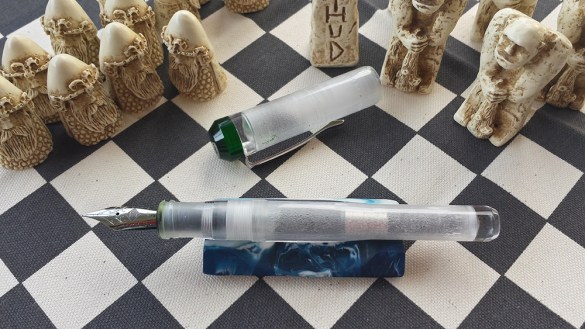
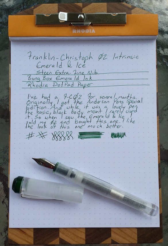
I’ve had several Franklin-Christoph pens over the past couple of years. Most have moved on to other owners as my tastes have changed. One exception to this was the Franklin-Christoph 02 Intrinsic Anderson Pens Special Edition (black body with bright pearlescent blue section and final). But when I saw the F-C 02 Emerald & Ice version I knew I wanted it in my collection. With one notable exception, I’m not the kind of person to have multiples of the same pen, so I sold my Anderson F-C 02, and bought the Emerald & Ice.
Appearance: 8/10
I really think this pen is beautiful. And more importantly, the “ice” effect—done by applying some sort of texturing treatment to the interior of the cap and barrel—is something unique to my collection. The Emerald final—made of a slightly pearlescent darkish green material—provided a nice contrast to the Ice body. The pen tapers dramatically from the section, back toward the end, which results in a silhouette that is odd, but not unpleasant.
I think I would have preferred if the section was also the Emerald material. I usually write unposted, and this would have given the pen body just a bit of flair. However, I know from reading reviews of the Smoke & Ice version many people suggested wanting the section to be clear—so it’s really sort of a personal preference.
Construction: 9/10
This is an uncommonly well-made pen. The shape was very well thought out—the taper ensures that the pen is only 3mm longer when posted than when capped. Where the Clear material is untreated—at the ends—the pen is crystal clear. A few reviews have mentioned that the clips feel flimsy, or cheap. I don’t know if I agree, but I also really don’t care about clips, as long as they keep the pen where it should be.
The construction highlight of this pen is the threads that seal the pen to the cap. They are all the way down at the end of the section. Not only are they so forward that you won’t touch the threads unless you hold your pen uncommonly close to the nib. But even if you do, F-C used block threads so there are no sharp ridges.
Filling: 8/10
It’s a C/C. I like C/Cs. The threads are at the very end of the section, so they will get inky; but since they’re block threads they’re just as easy to wipe off as any smooth part of the pen.
It’s also made to work as an eyedropper. In fact, as other reviews have touched on, the “ice” effect seems to be enhanced when using the pen as an eyedropper. But I hate eyedroppers. My hands are always a little warm, and no matter what I do I wind up with globs of ink on the page. So I’ll never get to see this pen in all its glory.
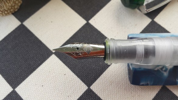
Nib: 8/10
I got the Steel Extra Fine nib. While there’s nothing special about the nib, it came in perfect condition. Smooth, and had obviously been tuned—wet but not too wet. No spring to it—at least not yet. IN the near future this one will be headed off to Art of Art’s Nibs for the Tomahawk treatment.
Test Drive: 9/10
This pen feels great in my hand—which I already knew from my previous experience with the F-C 02. Of all the F-C pens I have tried (02, 19, 25, 27, 29) this is my favorite. They’re all great writers but this one feels the best—it just fits my hand and my writing.
What stops it from being a 10 is that the cap is not particularly secure when posted. After a couple of minutes of writing the cap loosens a little, and while it’s never fallen off it will loosen enough that it will rattle a little, until I either take it off the pen or re-secure it.
Overall: 8.4/10
The Franklin-Christoph 02 Intrinsic Emerald & Ice. Beautiful, well-built and a great writer, it’s a great everyday pen.
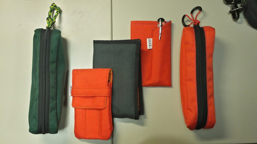
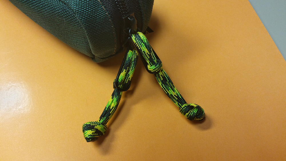
The Nock Family: Brasstown, Lookout, Hightower, Fodderstack XL, Brasstown
There are plenty of reviews of the various Nock Cases lurking around the web. This one will have a different focus. I’m going to take a look at the cases as a group. Think of it like a review of a collection of short stories instead of just a single story.
I was a backer for Nock’s Kickstarter campaign. While others bought several cases, or even the whole lineup, I only signed up for a single Hightower case. Frankly I had concerns that the fabric they used would be too rough for pens with more delicate finishes. So I decided to try one, and see how I liked it.
In the subsequent year+ I’ve had several of these cases come in and out of my possession (which should tell you how I felt about the fabric once I had it), I’ve had several low-level email exchanges with Brad (assuming he doesn’t have someone else answering his emails), and I’ve manually modified two of the cases. And I’ve carried the cases every day. In short, I’ve had enough interaction with the cases and the company to give a thorough review.
To begin here’s a list of all the cases I’ve had. The ones in bold I still have.
Brasstown, Forrest/Sunshine: This is the one I carry in my messenger bag when I go to work. It gets used maybe 2-3 days each week.
Brasstown, Mandarin/BlueJay, Modified: I’ve modified this one so that it holds larger items. At this point it’s sort of a catch-all for larger items (harmonicas, knives) if I’ll be carrying them around or packing them in luggage.
Hightower, Steel/Mango: This one has two main uses. It’s my go-to case if I just need one or two pens and a small notebook, but I also use it to transport pens in my bag on the workdays that I don’t use the Brasstown.
Hightower, Mandarin/BlueJay: Given away as a gift.
Hightower, Steel/BlueJay: This was the one I got through the Kickstarter. I ripped out one of the bartacks to combine two pen slots into one larger slot. Unrelated to the modification the case got dropped in the parking lot and the oil wouldn’t come out.
Sassafrass, Mandarin/Mango: Sent in error and returned to Nock…but I looked it over first. I liked the color combo so much I bought a new Lookout in this combo.
Lookout, Mandarin/Mango: I use the Lookout when I’m going somewhere to write and I’m taking my Midori or large Rhodia pad.
Lookout, Steel/Mango (sold as part of downsizing pen collection)
Lookout, Forrest/Sunshine (sold as part of downsizing pen collection)
Fodderstack XL, Mandarin/BlueJay: The Fodderstack XL is my newest addition to the range, and I carry it around at work, loaded with a pen, a pocket notebook, and some index cards.
Appearance (Comments for all models as a group)
The Nock Cases have a rugged, casual look about them. If you’re a style conscious person it might look out of place to pull one of these cases out of your suit pocket or leather briefcase, but they go along perfectly with backpacks and casual bags. That’s not a knock against them, but cases are chosen as much for their looks as how they protect your pens. And if you’re expecting a case that looks rich, you’re going to be disappointed. These are cases designed for EDC—after all, they’re named after mountains.
Each of the cases (except for a version that I have never owned) are made of two different grades of Nylon. The color combinations change from time to time—there are seven right now, and a few more have been phased out, or were used for limited runs. The interior colors are fairly bright—with one exception—while the exterior tend to be darker, but the Mandarin and Sky colors are fairly bright. Personally I think the color choices are nice. And while I understand why we can’t mix-and-match our own color combinations, it sure would be nice. In case Brad reads this…please make the new “Halftower” in a new Forrest/Mango combo.
Construction (Comments for all models as a group)
I’ve already said these cases are designed for EDC, so it’s no surprise that construction is where these cases shine. They are sewn with a variety of seams—exposed, hidden, reinforced, and bartack—and all of them are solid. I’ve now modified two cases by ripping out stitches, and ripping them out was no easy task. It took 5-10 minutes to get out a single seam to turn two pen slots into one. Errors in manufacturing aside if you blow a seam on one of these cases you’re doing something very, very wrong with your case. Looking inward from the seams, the two different grades of nylon are strong and even after a year of use don’t have any major wear.
During the Kickstarter campaign I commented that I was skeptical that the nylon used would we be gentle enough on delicate pen finishes. While I’m much less concerned, now that I have the cases and have used them for a year, if I had any ultra-high-end, ultra-glossy pens, I still might be a little wary whether the nylon (strong, not scratchy, but not what I’d call soft either) might not dull the finish over time—BUT, and I can’t stress this enough, I’ve not had the problem with any of pens, ranging from cheap to high-end.
Price (Comments for all models as a group)
The advantages of selecting cases built to carry around, is that the materials aren’t expensive. Even taking that into account, these are a remarkable value. Prices ranging from $17 (Fodderstack XL) to $35 (Brasstown) are refreshingly low (note: there are two cases lower than $17, but I don’t have either of them). The Lookout offers secure protection for three pens, for anything short of crushing, for $20. In 2015 that’s a steal.
Company (Comments for all models as a group)
One of the advantages of buying from a small company, be it a start-up or a maker’s shop, is the ability to connect with owner or employees of the company. When I decided that I wanted to modify one of the cases I asked Brad for advice, to make sure I didn’t ruin the case. I got an email back, the same day, telling me that other’s had made similar mods, and that I should have no trouble. He even asked me to let him know how it went. Likewise, when I’ve wanted a particular model in a particular combination he can generally give me a pretty good estimate when more will be posted to the site.
All of my cases have come marked with the Made in USA label. I like this. Not for any nationalist pride, but because for this type of product it means that the work was done in one place—no wasteful shipping between manufacturing locations. It’s a few people working together to make a good product to fill a need. It’s the kind of business I’m happy to support.
On to the actual cases…
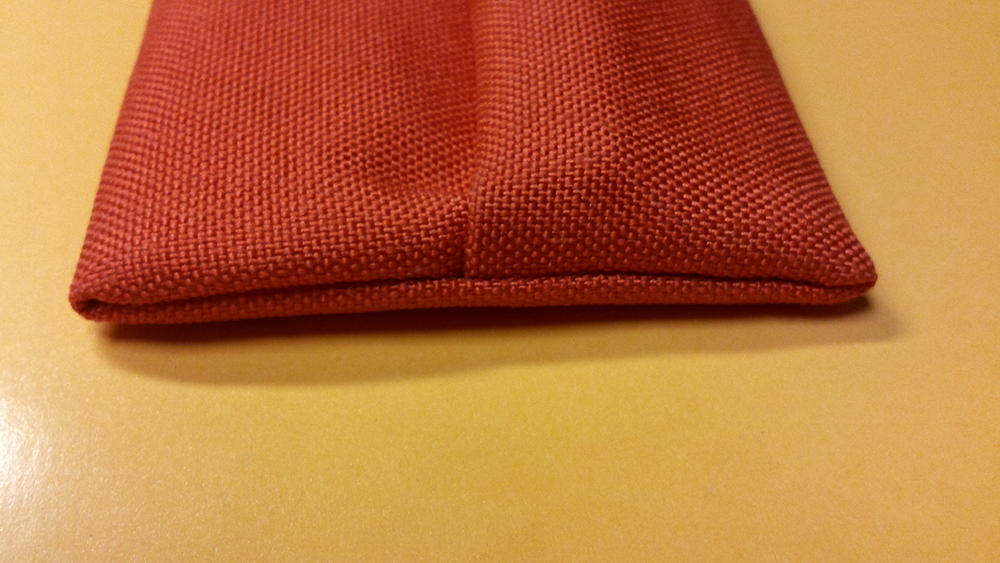
The Brasstown Holds: 6 pens with room for extras
Pros: Roomy
Cons: Noisy Zipper, No Notebooks
This is Nock’s largest case. Closed, it looks not unlike a traditional pencil case. But inside is a “tongue” that unrolls to reveal 6 pen slots. The tongue does not have a flap that folds down over the pens’ clips, but that’s a good thing. Not only would the flap make the rolled-up tongue much thicker, but it’s unnecessary, as the rollup will be tucked into the zipper pouch anyway. The roll-up is large enough that even holding 6 pens there’s still a little room left over for small bits and bobs. I keep small UV keychain light (for using Noodler’s Blue Ghost to send letters to my kids), a FitBit charger, a USB drive and some days even a harmonica in there to keep my pens company. It can be a bit large for everyday use, but it’s ideal for packing into a backpack, or into luggage for a trip.
The one criticism I have—and I’ll freely admit this is a quibble—is the zipper. It’s noisy. If I don’t silence the zipper and put it in my backpack, I can hear the zippers rattle with each step. It’s not difficult to fix this; for one I cut off the zipper pulls and replace them with cord and rubber finger loops, for the other I wove cord through the zippers. Both of these solutions have the added benefit of allowing me to hand the case from a hook when needed. Ideally, this could be solved with using smaller zipper handles, rubberized zipper handles, or having a flap of fabric cover the zipper (like on the zippers of pants). I get that this would add a little to the price, and since it’s not hard to fix myself, this wouldn’t affect my use of this case. Like I said…it’s a quibble.
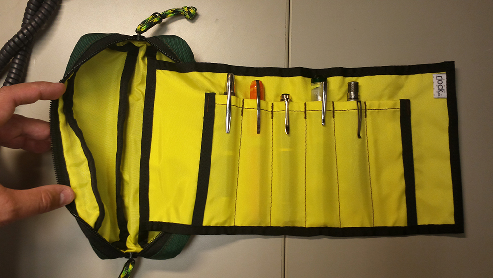
The Hightower Holds: 3 pens, 1 notebook
Pros: Notebook sleeve is roomier than Fodderstack XL
Cons: Can open in a bag
A small nylon folio, the Hightower opens to reveal three pen slots inside the front cover, and one notebook slot inside the back cover. There is a flap that folds down to cover the pens clips, that serves to keep the pens from sliding out of the slots when the case is closed. I love taking this one along when I go out for the day, or over to a friend’s house for the evening. I love that it holds my preferred pocket notebook, the Rhodia Unlimited 9x14cm 60 sheets, with enough room left over for index cards or a few folded sheets of paper or receipts. In fact I can even get two of these notebooks into the Hightower, though it doesn’t close all that well.
Drawbacks? Yes, one. If I put this is a bag, it sometimes works its way open. I’ve never had a pen fall out—thanks to that flap—but I have had a notebook fall out on occasion. Otherwise I just love this case.
The Lookout Holds: 3 pens
Pros: Small, Secure
Cons: No notebook
For me, this is the least versatile of all the cases. It only holds one thing—pens. Depending on the day this can be a plus or a minus. If I’m going somewhere to write, and I’m taking a larger format notebook, this case goes along perfectly—I can take three pens, or two and my ink pot. But if I’m not carrying a larger notebook with me, this one is just too limiting.
That said, if you’re packing your pens for later, the loop across the front of this case hold the pens very securely. If I toss one of these in my bag I know the pens aren’t going anywhere.
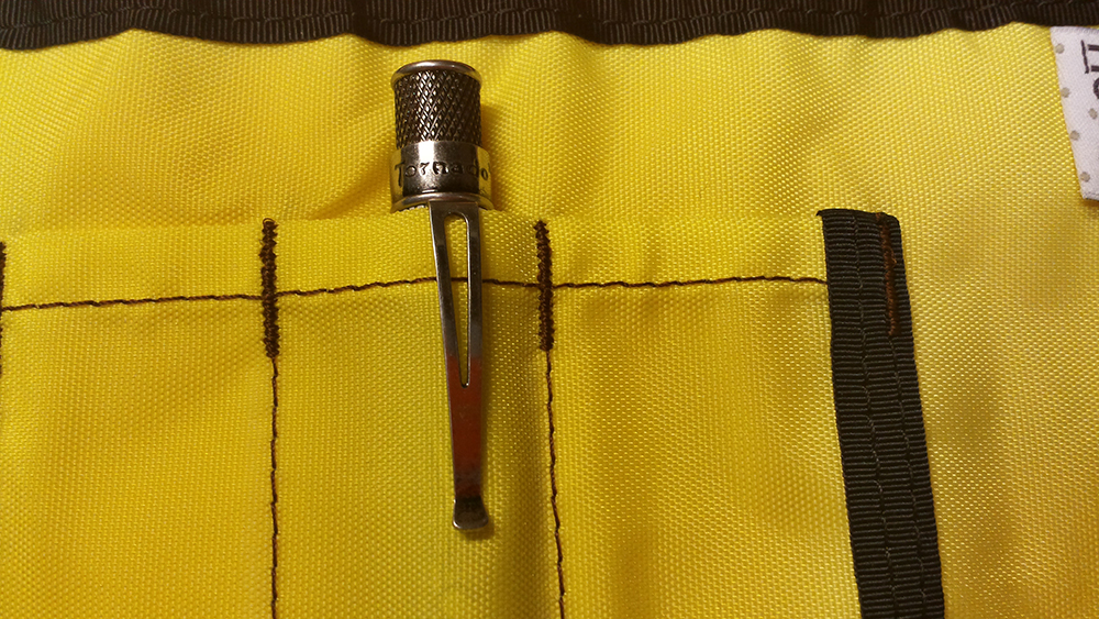
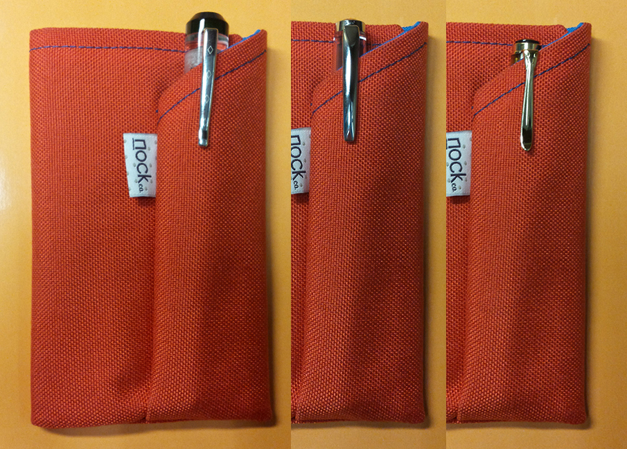
The Fodderstack XL Holds: 1 pen (2 if you’re ok with them touching), 1 notebook and/or index cards
Pros: Crazy Convenient
Cons: Fairly limited in the size of notebooks and pens
I have frustrating relationship with the Fodderstack XL. For starters, it’s a ridiculously convenient case—holding one pen and one pocket notebook. If I just want to have somewhere to take notes or write down the stray thought, this case fits the bill. However, this is not a versatile case. If I want to use it I have to adjust to it—not vice versa. The problem is the very thing that makes it convenient—its size.
It was designed to hold the Nock pocket notebook (9x14cm), so it also holds the Field Notes books easily. However, it doesn’t like my beloved Rhodia notebooks (also 9x14cm) because they’re just a tiny bit thicker than the Nock notebooks. It also doesn’t like the Clairfontaine 9×14 notebooks. So it’s not like I can’t find something to fit in there, but it’s won’t take my Rhodia notebooks because the tolerances on the small case are just that tight.
Franklin-Christoph 02, TWSBI 580, Pelikan M200
Similarly, using this case you need to be conscious of what pen you put in there. My favorite, lately, in the Franklin-Christoph 02—a fairly large pen—and it sticks up above the top of the case. So if I’m going to take this with me I can’t just toss it in my bag, but instead need to put it somewhere where the exposed end of the pen is protected. The TWSBI 580 is just a hair too long, but the Pelikan M200 is small so that one gets plenty of protection.
I love that if I’m going to a business meeting this case tucks nicely into my Suit’s lapel pocket.
Last Words
I get that these cases aren’t for everybody. If you carry around twenty pens, these aren’t for you. Likewise, if you prefer cases made of leather or fancy materials, move along. But if you’re ok with the casual look and feel, these cases almost certainly have a good way for you to carry around a few pens. Whether it’s tossing your rollerballs and pencils in your backpack, or making sure you always have your favorite fountain pen at the ready, these cases are a good bet.
I’ve seen some of the teaser pictures for the new “Halftower” case which combines featured of the Hightower and Brasstown cases. Additionally I’d love to see a case that holds an A5 notebook or pad along with one or two pens. But first and foremost I’d love to see a new color combination—fingers crossed for Forrest/Mango (if not that one, then Midnight/Sunshine).


 I may not get to keep this one either. My wife, who is generally partial to very thin, very light pens has already hinted that, while this pen is huge, I shouldn’t panic if I notice it missing.


 Like many of you, in various English classes through Junior and Senior High I had to keep a journal. For the first 5 minutes of class we each pulled out a cheap spiral notebook and wrote about…whatever. I’m sure the intent, when the assignment was first conceived, was a bit more focused than it was by the time I made my way into the classes. If the intent was to have us write about anything profound, or to make progress toward some useful writing, it was lost on me–especially the years where English was the first or second class of the day.
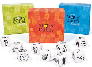 So when I came across these boxes in my local game store it wasn’t a difficult decision to fork over $7 to try it out.
 I love Franklin-Christoph pens–and I love the company, too. This is, in part, local pride as we’re both residents of North Carolina’s Research Triangle. However, I also love them because of all the companies I’ve seen, F-C seems to have a flair for experimentation and innovation.